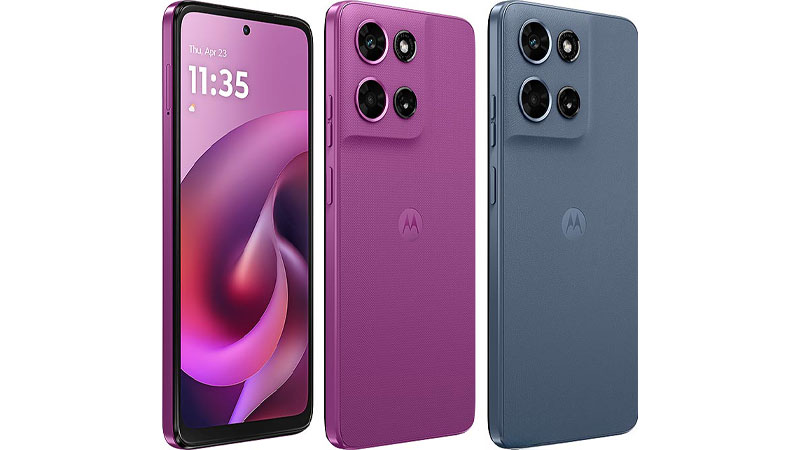
The Motorola Moto G (2026) colors immediately signal a shift in the budget smartphone market. Motorola continues its powerful collaboration with Pantone, the global authority on color. This partnership elevates the aesthetic of the accessible Moto G series. It moves the design far beyond the typical, uninspired gray and black finishes. Selecting the right color for your device is a personal statement. It reflects your style and your appreciation for quality design.
The Moto G (2026) arrives in two distinct, deeply curated Pantone finishes: Slipstream and Cattleya Orchid. This comprehensive review explores each option in detail. It compares the visual impact, practical ownership experience, and psychological appeal of both colors. Use this guide to determine which hue perfectly matches your lifestyle and preferences.
The Strategic Importance of Color in the Moto G Series
Motorola positioned the Moto G series as the best choice for value-conscious consumers. Yet, the company never compromises on expressive design. Color plays a critical role in this philosophy. It turns an affordable, feature-rich phone into a desirable style accessory. For many years, competitors reserved high-design color schemes for their expensive flagship models. Motorola disrupted this trend by bringing Pantone-validated colors to the mid-range.
This focus on vibrant, trend-forward hues personalizes the device experience. The Pantone partnership ensures the colors are precise, rich, and relevant to current global design trends. These are not merely generic colors. They are specific, curated shades that convey a sense of premium quality.
The color choice affects the perceived sophistication and visual appeal of a smartphone. A unique finish can make a budget phone feel significantly more luxurious. This helps the Moto G (2026) stand out fiercely in a saturated market. The design effectively uses these colors. It creates a cohesive look that suggests a higher price point. The two available colors offer a compelling contrast. They cater to different personality types, from sophisticated minimalists to expressive creatives. This design approach is central to the Moto G’s identity. It focuses entirely on empowering user expression.
Elevating the Budget Aesthetic with Pantone
Budget devices often cut costs by sacrificing aesthetic details. They use basic materials and simple colors. The Moto G (2026) actively challenges this common expectation. It uses the Pantone validation to introduce a high-end design element at an accessible price point. The phone’s back panel often features a soft, refined vegan leather finish. This choice of material enhances the chosen color significantly.
This construction adds a tactile, premium quality to the phone. It sharply contrasts with the glossy, fingerprint-prone plastic used by many rivals. Motorola’s use of validated, distinct colors ensures authenticity and depth. This gives the user confidence in their style selection. The Moto G (2026) becomes an extension of the user’s personal brand. It functions as a fashion statement as much as a daily technology tool.
Deep Dive into Pantone Slipstream: The Metallic Gray Statement
Pantone Slipstream is one of the primary colors for the Moto G (2026). It is a sophisticated, highly refined shade that sits between gray and a very light metallic blue. This hue belongs to the Purple-Blue family within the Pantone Metallic Shimmers library. Its official description highlights a subtle metallic shimmer. This gives the color a dynamic quality as light hits it. Slipstream appeals to users who demand elegance and professionalism. They want a device that offers a quiet, strong sense of style.
Aesthetic Review
Slipstream is a cool, composed color. It offers a subtle metallic sheen, which prevents it from looking flat or dull like a standard gray. The color features light blue and purple undertones, visible under specific lighting conditions. This complexity adds depth and visual interest. It is a color that works well in both professional and casual environments.
In bright light, the metallic element shines gently. It highlights the phone’s refined lines and the camera module design. In dimmer settings, Slipstream retains its light, silvery character. It provides an alternative to the heavy darkness of black phones. This color choice projects modernity, precision, and a minimalist luxury aesthetic.
Psychological Profile and Buyer Fit
The color gray often represents balance, neutrality, and sophistication. The metallic shimmer in Slipstream adds a sense of technology, speed, and future-forward design. Users who choose Slipstream likely value functionality and timeless style. This color choice suggests a person who is professional, organized, and prefers understated quality over flashy display.
Slipstream is particularly popular among working professionals and users who seek a long-term, versatile look. It projects calm competence. It is the perfect option for someone who wants a phone that blends seamlessly into any environment without disappearing entirely. It is the choice for the confident pragmatist.
Pros and Cons of Slipstream
Pros:
- Versatile and timeless metallic gray color suitable for all settings.
- Excellent ability to resist the visual appearance of fingerprints and minor smudges.
- The metallic finish offers a premium look rarely seen at this price point.
- Maintains a clean, polished appearance over time.
Cons:
- Can appear too subtle or conservative for users preferring vibrant, bold colors.
- The slight metallic shimmer may be less noticeable in low-light environments.
- Offers less personal expression compared to the Cattleya Orchid option.
Specialized Comparison: Slipstream vs. Previous Black/Gray Options
Previous Moto G models typically featured “Slate Gray” or “Carbon Black.” These older colors were simple, single-pigment finishes. They often lacked the depth and refinement of Slipstream. Slate Gray was usually a flat, matte plastic. Carbon Black was typically a dark, sometimes reflective, plastic.
Slipstream is a major aesthetic upgrade. Its Pantone validation ensures a precise, high-quality hue. The metallic shimmer pushes it closer to the finishes found on high-end flagship phones, such as the Edge series. This difference makes the Moto G (2026) feel far more expensive than its price suggests. It signals Motorola’s continuous commitment to upscale design elements in budget-friendly hardware.
Practical Ownership: Fingerprint Visibility and Case Compatibility
The Moto G (2026) uses a high-quality vegan leather finish. This material inherently handles smudges well. Slipstream performs exceptionally well in minimizing the appearance of daily wear. Its light gray shade and metallic element work together to diffuse light. This effectively camouflages dust and minor fingerprints. Users who carry their phone without a case will find Slipstream requires minimal cleaning.
Slipstream offers tremendous flexibility when choosing accessories. It pairs effortlessly with almost any case color, from stark black and white to vibrant red or blue. A clear case allows the subtle metallic quality of Slipstream to remain visible. A dark case provides a sharp, sophisticated contrast. This color choice is safe for users who frequently change their protective cases.
Deep Dive into Pantone Cattleya Orchid: The Rich, Expressive Purple
Pantone Cattleya Orchid is the Moto G (2026)’s bold, expressive color option. It is a rich, deep purple shade with clear red undertones. This hue draws inspiration from the exotic and luxurious Cattleya orchid flower. It is classified in the Red-Purple family. This is a color steeped in meaning, often associated with creativity, luxury, and artistic expression. Motorola offers this striking color for users who want their device to make an unambiguous, vibrant statement.
Aesthetic Review
Cattleya Orchid is an intensely saturated and commanding color. It offers a sense of drama and elegant depth. Unlike pastel or lavender shades, Cattleya Orchid has a mature, sophisticated presence. It is bright and dark simultaneously, allowing it to capture attention effectively without being overly aggressive. The color beautifully emphasizes the contours of the phone. It draws particular attention to the unique design of the camera island.
This color looks particularly stunning under artificial and ambient light. It shifts subtly, revealing the rich red and pink influences within the deep purple base. It represents a bold style choice. It is a fantastic option for users seeking a device that feels unique and carefully considered.
Psychological Profile and Buyer Fit
Purple is often linked to wisdom, mystery, imagination, and royalty. Choosing the Cattleya Orchid suggests a user with a powerful sense of individuality and creative flair. These users do not shy away from the spotlight. They see their smartphone as a direct extension of their bold, expressive character.
This color is ideal for artists, creative professionals, and anyone who wants a phone that projects confidence and unique, refined taste. It serves as a true standout in the often dull budget smartphone category. It is a choice that communicates passion and sophisticated energy.
Pros and Cons of Cattleya Orchid
Pros:
- Highly distinctive and extremely eye-catching design.
- Symbolizes creativity, individuality, and luxurious taste.
- Maintains a rich, vibrant appearance in various lighting conditions.
- Excellent for users prioritizing personal style expression and uniqueness.
Cons:
- Its intensity may be too bold for users who prefer extremely conservative aesthetics.
- Darker, richer hues may slightly show light dust or oil smudges more easily than the brighter Slipstream.
- Can be more challenging to pair with certain accessory colors.
Specialized Comparison: Cattleya Orchid vs. Past Purple Shades
Motorola has offered purples before, such as the deeper Parachute Purple on the G67 Power. However, Cattleya Orchid is unique due to its strong reddish, almost magenta, undertones. Past purples often leaned heavily toward blue or were softer lavender shades.
Cattleya Orchid on the Moto G (2026) offers a more floral, luxurious feel. It is less purely “techy” than the blue-leaning purples. This shade directly competes with the premium purples seen on high-end flagship devices from Samsung and Apple. The difference is the price point. Motorola brings this high-fashion color to a budget-friendly device. The Pantone validation ensures the exact shade is consistently rich and high-quality.
Practical Ownership: Long-Term Appearance and Accessory Pairing
Cattleya Orchid utilizes the same fingerprint-resistant vegan leather finish as Slipstream. While the darker shade may technically show slight smudges more easily than the light metallic gray, the richness of the pigment helps to mask minor imperfections. The color’s depth ensures it ages gracefully. It maintains its intensity without fading.
Pairing accessories with Cattleya Orchid requires thoughtful consideration. Clear cases are highly recommended. They allow the unique purple color to be the focus. Dark black or navy cases provide a beautiful, harmonizing contrast. Users should avoid clashing neon or primary-colored cases, as they can detract from the color’s sophistication. It works best with muted, metallic, or complementary purple accessories.
The Moto G (2026) Palette vs. The Competitive Landscape
The Moto G (2026) distinguishes itself through the coherence and quality of its entire two-color Pantone palette. This choice of colors provides a clear aesthetic advantage over nearly all mid-range rivals. Understanding this comparison is essential for prospective buyers who value design and finish quality.
Aesthetic Sophistication and Validation
Most competitor devices in the budget segment rely on basic, single-pigment colors. They typically offer colors like simple “Black” or “White.” These hues are purely functional but lack any significant design depth. Motorola’s use of Pantone-validated Slipstream and Cattleya Orchid introduces a layer of design authority.
This validation guarantees a precise, rich, and currently trending hue. It directly translates to a final product that looks and feels more expensive than its actual cost. It demonstrates a commitment to style often reserved exclusively for premium-priced flagships. This move reshapes consumer expectations for what an affordable phone can look like.
Finish and Material Quality
The chosen color is inextricably linked to the finish quality. Many budget competitors use glossy plastic that attracts fingerprints instantly and scratches easily. Motorola uses a refined, textured vegan leather finish on the Moto G (2026).
This unique texture, combined with the Pantone color, creates a superior tactile and visual experience. Slipstream looks sophisticated and cool on this matte texture. Cattleya Orchid takes on a luxurious, fabric-like quality. The superior finish helps the Moto G (2026) feel like a durable, well-considered object. This is a critical differentiator in the competitive budget smartphone market.
Conservative vs. Expressive Palettes
The Moto G (2026) palette is intentionally expressive, even with only two colors. It gives the user a choice between two strong design statements. Slipstream is a sophisticated, future-forward metallic gray. Cattleya Orchid is a vibrant, creative, luxurious purple.
In contrast, most rivals offer conservative palettes. These conservative choices prioritize mass market appeal over individual expression. Choosing the Moto G (2026) means actively choosing a device that rejects this trend of aesthetic blandness. It positions the user as someone who actively values design and color in their technology. This choice is especially appealing to younger demographics and design-conscious consumers.
Key Considerations for the Buyer
Selecting the Moto G (2026) color involves a few practical considerations beyond simple aesthetic preference. The choice can affect the long-term ownership experience. Buyers should think about resale value, durability, and how the color complements their personal items.
Resale Value Considerations
Personal preference drives the initial purchase. However, potential resale value is a factor for many users. Generally, conservative and neutral colors like black, gray, or silver tend to hold their value slightly better. They appeal to a broader secondary market.
In this lineup, Pantone Slipstream, with its metallic gray base, is the more universally appealing color. It represents the safer choice if maximizing future resale value is a top priority. Conversely, the highly unique Cattleya Orchid might attract a specific niche buyer. This buyer might be willing to pay a premium for its rarity. However, its vibrant nature might limit its appeal to a smaller pool of potential second-hand buyers overall. If you plan to keep the phone for its full life, choose the color you truly love. This factor becomes negligible in that case.
Durability and Construction Quality
The Moto G (2026) is built for everyday longevity, fitting its powerful specifications. The internal frame is typically constructed from high-quality, structurally sound plastic. The back panel, adorned with the Pantone colors, uses the durable vegan leather. This material is highly resistant to minor scratches and micro-abrasions. It performs much better than the glass backs found on more expensive devices.
The phone also carries an IP52 rating for splash resistance. This is essential for protecting the expressive Pantone finishes from everyday spills and environmental elements. The robust construction enhances the perceived value of the expressive colors. It ensures their beauty is maintained over time.
Final Aesthetic Choice and Personal Brand
A smartphone is a device you use and look at hundreds of times every day for several years. The color choice has a continuous, subtle psychological effect. This is the long-term aesthetic consideration that matters most.
Choosing Slipstream means carrying a touch of modern sophistication with you. This color choice never feels overwhelming or distracting. Its metallic gray maintains its contemporary feel. It will not look dated quickly because neutral metallics are always a fixture in technology design. Slipstream provides a continuous sense of calm, precision, and clarity. It is the most balanced and enduring color choice.
Opting for Cattleya Orchid means making a strong statement. Its boldness ensures the phone remains a talking point. Users must be prepared for the device to frequently stand out. This continuous visual excitement suits those with dynamic, artistic personalities. The richness of the purple ensures it ages gracefully, maintaining its deep intensity. This color makes a statement not just on the first day, but for the entire duration of device ownership.
Conclusion: Making Your Final Color Decision
The Motorola Moto G (2026) offers an excellent opportunity to choose a device that truly reflects your individual style. This is thanks to its exclusive, premium Pantone color palette. Both Slipstream and Cattleya Orchid are carefully curated and beautifully executed on the vegan leather finish.
If you value sophistication, versatility, and a modern, minimalist aesthetic, Pantone Slipstream is the ideal choice. It projects quiet confidence, handles daily wear well, and suits any professional setting.
If you seek boldness, luxury, and expressive individuality, the Pantone Cattleya Orchid is the clear winner. This rich, artistic hue ensures your Moto G (2026) stands out as a unique and beautiful accessory.
Ultimately, both colors benefit immensely from the premium look of the Pantone collaboration and the phone’s high-quality finish. The best decision is to choose the color that instinctively resonates with your personal brand. You buy the Moto G (2026) for its solid 5G performance and battery life. You choose the Pantone color for its enduring and high-end style.
Frequently Asked Questions (FAQ)
What is the finish of the Moto G (2026) back panel?
The Moto G (2026) typically features a vegan leather finish on its back panel. This finish enhances the texture, improves grip, and makes the colors look more premium and less prone to visible fingerprints compared to glossy plastic.
Does the color choice affect the phone’s 5G performance?
No, the color selection has absolutely no effect on the phone’s technical performance. Both the Pantone Slipstream and Cattleya Orchid versions deliver the same blazing-fast 5G speeds, camera quality, and battery life.
Which of the Moto G (2026) colors is better at hiding scratches?
Pantone Slipstream is generally better at hiding minor surface scratches and abrasions. Its lighter, metallic-gray nature helps the eye overlook small imperfections more easily than the deeply saturated Cattleya Orchid.
Are these Pantone colors exclusive to the Moto G (2026) model?
The specific Pantone shades, Slipstream and Cattleya Orchid, are often exclusive to Motorola devices for a period. They represent a carefully curated palette for the 2026 G-series, ensuring the phones have a unique, designer-approved look compared to other brands.
Is the metallic effect of Slipstream a paint or a textured finish?
The metallic effect in Slipstream is a component of the Pantone pigment itself. It is applied to the vegan leather finish to provide a subtle shimmer. This makes the color dynamic without relying on a purely glossy, metal-like coating.


