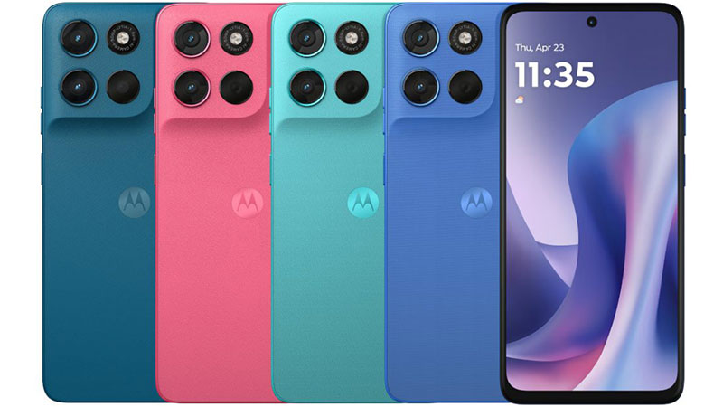
Motorola Moto G57 Power colors elevate the standard of mid-range smartphone aesthetics, bringing a touch of high-fashion design to powerful, long-lasting mobile technology. Choosing the right color for your new device is more than a simple aesthetic preference. It defines the personal statement you make every time you pull your phone from your pocket. Motorola partnered with the globally recognized color authority Pantone to curate a palette that is both vibrant and deeply considered. This comprehensive article delves into the five distinct color options: Fluidity, Pink Lemonade, Corsair, Meteorite, and Regatta. We will thoroughly review each shade, offering specialized comparisons, noting key buyer points, and analyzing the overall impact of color on the Moto G57 Power experience. This analysis helps you find the perfect shade that matches your lifestyle and preferences in a competitive smartphone market.
The Design Philosophy: Pantone and Motorola
Motorola consistently focuses on fusing durability with distinctive style in its smartphone lineup. The Moto G57 Power continues this tradition, but it does so with a significant commitment to color intelligence through its partnership with Pantone. This collaboration ensures the device’s colors are not merely generic hues. They are carefully selected, trending shades that carry specific emotional and aesthetic weight. The design choice is deliberate, aiming to make the robust Moto G57 Power stand out in a sea of monotonous black and silver devices.
The Collaboration with Pantone
The Pantone Color Institute serves as the world’s leading authority on color standards and trends. When Motorola leverages Pantone colors, they provide buyers with colors that are professionally endorsed and globally recognized. This partnership offers a guarantee of quality and contemporary relevance in the chosen shades. Every color featured on the Moto G57 Power is a specific, calibrated Pantone shade. This means the hues possess a unique depth and consistency across different devices. Buyers gain a product with an artistic, high-end feel, which is uncommon in the affordable “Power” segment of the smartphone market. This attention to detail differentiates the Moto G57 Power from its budget-conscious competitors.
Material and Finish: Vegan Leather Look
All the beautiful colors on the Motorola Moto G57 Power are applied to a unique back panel finish. This finish often utilizes a high-quality silicone polymer material, designed to mimic the luxurious, soft texture of vegan leather. This choice is crucial to the overall aesthetic appeal and practical performance of the phone. The vegan leather texture enhances grip, reducing the chance of accidental drops. It also minimizes the visibility of fingerprints and minor scratches, which typically plague glossy plastic or glass backs. The material choice works symbiotically with the Pantone color selection. It provides a rich, matte canvas that allows the sophisticated colors to shine without excessive glare. The combination of Pantone colors and the vegan leather aesthetic gives the Moto G57 Power a premium feel that belies its mid-range price point.
Comprehensive Review and Comparison of Motorola Moto G57 Power Colors
Each of the five color options for the Moto G57 Power tells a unique story. They cater to different user personalities and aesthetic goals. We analyze each shade in depth, providing the insights necessary to make your final choice. Remember that the phone’s massive 7000mAh battery provides its foundational power, but the color provides its public identity.
Pantone Fluidity: Deep Dive
Pantone Fluidity is a refreshing and tranquil shade. It sits between a light aqua and a cool mint green, reminiscent of clear ocean water or a pale summer sky. This color choice conveys calmness, innovation, and a light-hearted, modern sensibility. It is a color that feels clean and unobtrusive, yet distinct enough to draw positive attention. Fluidity is an excellent choice for users who appreciate subtle, nature-inspired tones and a minimalist aesthetic.
The specialized comparison shows that Fluidity offers a much softer alternative to the aggressive blues and greens seen in many competing mid-range phones. For example, a typical competitor’s teal might look electric or intensely saturated. Fluidity is muted and sophisticated, providing a high-end look without the high-end price tag. This sophisticated subtlety is a hallmark of the Pantone selection.
Pros of choosing Fluidity include its excellent ability to conceal dust and smudges. Its light, matte surface keeps the phone feeling fresh and clean throughout the day. The color also promotes a sense of peace and clarity, a psychological benefit in a high-stress world.
Cons of Fluidity are few, but important to note. Because it is a light color, it might show heavier stains or dark scuffs more prominently over time if used without a case. Furthermore, if you prefer bold, high-contrast technology, Fluidity might appear too subtle or pastel for your tastes.
Important buyer points for Fluidity center on accessorizing. The color pairs beautifully with clear or white cases, allowing the gentle hue to remain visible. It appeals to a younger, design-conscious demographic who values contemporary softness over traditional deep tech colors. This color choice emphasizes style and calmness over sheer power.
Pantone Pink Lemonade: Deep Dive
Pantone Pink Lemonade is the Moto G57 Power’s most vibrant and overtly energetic color option. It is a warm, mid-tone pink with hints of coral or peach, capturing the refreshing, cheerful spirit implied by its name. This color is bold, confident, and unapologetically expressive. It is the perfect option for users who want their smartphone to be a lively extension of their personality. Pink Lemonade stands out immediately.
Comparing Pink Lemonade to standard phone colors highlights its unique position. Most smartphone brands offer a pale or rose gold variant for pink lovers. Pink Lemonade, however, offers a saturation and brightness that feels genuinely joyful and less metallic. It rejects the metallic neutrality often seen in previous Moto G Power pink variants. It truly embraces fun and vitality.
The primary benefit of Pink Lemonade is its visibility and individuality. It is difficult to lose this phone, and it ensures your device is never mistaken for someone else’s. The psychological impact of this bright color is powerful. It suggests playfulness, creativity, and a positive outlook.
A potential drawback is its long-term visibility. Due to its brightness, the color might show slight fading or change if constantly exposed to strong sunlight, though the vegan leather material helps mitigate this risk. Additionally, users in more corporate or reserved environments might find the color too striking or informal for constant business use.
Buyers considering Pink Lemonade should know that the color pairs wonderfully with contrasting accessories, such as dark blue or deep green cases. The shade performs well on social media. Its distinctness makes it instantly recognizable in photos and videos. This is the ultimate choice for the user seeking expressive and high-energy Motorola Moto G57 Power colors.
Pantone Corsair: Deep Dive
Pantone Corsair provides a deep, sophisticated entry into the color palette. This is a rich, dark blue or deep teal color, offering an immediate sense of gravitas and professionalism. It is not quite black, but it provides a near-black experience with the added depth and complexity of a dark, nautical hue. Corsair is the color of choice for those who value tradition, stability, and subtle luxury.
Corsair offers a refined alternative to the standard ‘Slate Gray’ or ‘Midnight Black’ of the broader smartphone market. Unlike plain black, Corsair interacts beautifully with light. The subtle grain of the vegan leather finish catches the light, revealing a hidden complexity of blue or green undertones. This makes it far more interesting than a flat, monochromatic black. It elevates the phone’s appearance significantly.
The main advantage of Corsair is its versatility and wide appeal. It looks professional in a business setting and remains sleek and elegant in a casual context. The dark hue is extremely effective at masking minor blemishes, dirt, and daily wear and tear. It represents a practical choice for heavy-duty users who want to maintain a premium appearance.
The cons are minor, primarily related to visibility in low light. The phone can be hard to spot in a dark car or room due to the depth of the Corsair color. It may also appeal to users who were hoping for a truly unique color, as dark blue and black remain ubiquitous in the tech industry. It is a beautiful shade, but it is less groundbreaking than Fluidity or Pink Lemonade.
For prospective buyers, Corsair is the most reliable color for maintaining resale value, as dark colors generally hold universal appeal. This color is highly recommended for users who plan to use rugged, opaque cases, as the case will likely cover most of the back panel anyway. Corsair is the premium, practical workhorse among the available Motorola Moto G57 Power colors.
Pantone Meteorite: Deep Dive
Pantone Meteorite is the deepest and most traditional color offered for the Moto G57 Power. It presents as a very dark, carbon-like grey, virtually indistinguishable from black in most lighting conditions. This color choice exudes power, classicism, and formality. Meteorite is designed for the user who prefers a timeless, unobtrusive, and powerful aesthetic for their core device.
Meteorite serves as the foundational, traditional color option in the G57 Power lineup. It compares directly to the standard black colorways found across virtually every smartphone manufacturer, from budget models to high-end flagships. However, Meteorite distinguishes itself through the Pantone depth and the matte, soft-touch vegan leather texture. This texture prevents the color from having the high reflectivity and fingerprint-magnet quality of a glass-backed black phone. This is a significant practical advantage.
The undeniable advantage of Meteorite is its ultimate discreetness. It works perfectly in any environment and never clashes with clothing or accessories. It is the most conservative choice and therefore the safest. Like Corsair, it excels at hiding daily grime, scuffs, and fingerprints, making it incredibly easy to maintain.
A disadvantage of Meteorite is its lack of personality. It is the least unique of the Motorola Moto G57 Power colors. If you want your phone to express a distinct aesthetic, Meteorite fails to deliver that statement. It blends in, which is exactly its purpose, but it may feel boring to some users over time. Furthermore, its darkness can make it hard to locate when placed on dark furniture.
Key buyer advice for the Meteorite option is simple: choose this color if you prioritize function and durability above all else. It is the practical choice. It also provides the perfect backdrop for vibrant, patterned, or transparent cases, allowing the user to change the phone’s visual identity easily without conflicting with the device’s base color. Meteorite is the essence of professional simplicity.
Pantone Regatta: Deep Dive
Pantone Regatta is a bright, true medium blue. It is a strong, definitive shade that immediately evokes nautical themes, reliability, and openness. Regatta is a spirited color, possessing more energy than the deep Corsair but maintaining a more traditional, stable quality than the bright Fluidity. It bridges the gap between reserved professionalism and youthful energy.
When placed next to competitors, Regatta often appears more saturated and pure than the typical light blue gradient effects common in the mid-range sector. It presents as a solid, dependable color that avoids the shifting, iridescent effects that can sometimes look cheap. Regatta’s Pantone pedigree ensures it is a clean, classic blue, offering a timeless appeal. It stands as a vibrant yet mature option.
The pros of choosing Regatta include its broad, universal appeal. Blue is statistically one of the most popular colors globally, making Regatta a reliable choice that few people will actively dislike. It strikes a fantastic balance. It is noticeable enough to stand out from black or gray, but not so attention-grabbing as Pink Lemonade. It provides a reliable pop of color.
One potential con of Regatta is its color maintenance. Being a medium-tone blue, it may be slightly more susceptible to showing light scratches or scuffs than the darker Meteorite or Corsair colors. However, the matte vegan leather finish helps to minimize this visual effect significantly. It is a minor consideration for most users.
Readers should note that Regatta is the ideal choice for someone wanting a color that is both expressive and serious. It signifies trustworthiness and reliability, aligning well with the Moto G57 Power’s core value of long battery life and dependable performance. Regatta is a solid, enduring option that maintains its visual appeal in various settings. This option is popular among power users who appreciate both form and function.
Color Selection Strategy: Making an Informed Choice
Selecting your ideal Motorola Moto G57 Power color requires balancing personal preference with practical considerations. Your smartphone is a device you interact with hundreds of times a day. Its aesthetic quality affects your satisfaction with the purchase. Consider three key areas before making your final decision: personal style, market trends, and competitive comparisons.
Considering Your Personal Style
The most important factor in your color choice remains your own personal taste. Do you prefer your technology to blend seamlessly into your professional life? Then Corsair or Meteorite are your strongest contenders. They offer deep, sophisticated tones that communicate stability. Conversely, if you view your phone as a way to inject personality and fun into your day, Pink Lemonade or Fluidity offer the expressiveness you desire. They are conversation starters. Regatta sits comfortably in the middle, appealing to those who want a strong color that is neither too neutral nor too flashy. Always choose the color that genuinely makes you happy.
Market Trends and Resale Value
Color plays a measurable role in the future resale value of any electronic device. While bold colors are trending, neutral and classic colors tend to hold their value slightly better in the used market. Meteorite and Corsair, being the closest to traditional black, will likely fetch the highest percentage of their original cost upon resale. These are considered the ‘safe bets’ in the tech world. Pink Lemonade, Fluidity, and Regatta appeal to niche audiences. They might sell more slowly, but they could sell quickly for a good price to a buyer specifically looking for that distinct hue. Choosing a trendy color like Fluidity means embracing a current style, while choosing Meteorite means minimizing financial risk.
Comparing with Competitors’ Offerings
The Motorola Moto G57 Power excels in offering Pantone-calibrated colors, a feature usually reserved for more expensive flagship phones. When you compare this palette to its direct mid-range competition, the difference is evident. Many competitors offer only basic, flat colors or use overly reflective plastic that diminishes the color quality. The Moto G57 Power’s combination of the vegan leather finish and the Pantone shades provides a tactile and visual superiority. Corsair, for instance, looks more refined than a standard deep blue from a rival brand. Pink Lemonade is far more vibrant than a simple rose gold. This comparison confirms that choosing any of the Pantone Motorola Moto G57 Power colors gives you a device that feels and looks premium compared to the typical mid-range smartphone.
Conclusion: Finding Your Perfect Motorola Moto G57 Power Color
The Motorola Moto G57 Power provides an impressive selection of colors, moving beyond the tired choices of the mid-range smartphone category. The partnership with Pantone ensures that every color—Fluidity, Pink Lemonade, Corsair, Meteorite, and Regatta—is rich, distinct, and aesthetically pleasing. Your decision should rely on a simple matrix of style versus practicality.
If you seek a serene, unique look with modern appeal, choose Pantone Fluidity. If you demand a vibrant, cheerful, and expressive device, Pink Lemonade is the clear choice. For sophisticated depth and practicality, Corsair offers an excellent blend of classic and complex dark blue. The user who prizes ultimate discretion and universal appeal should select Meteorite. Finally, Regatta is the perfect balance, offering a spirited, dependable, and universally appealing true blue. No matter your choice, the vegan leather-like finish on the Moto G57 Power ensures a premium feel that complements the selected color. You can confidently select the color that best reflects your unique style, knowing you have a powerful and beautiful device in hand.
Frequently Asked Questions (FAQ)
What material is used for the colored back of the Moto G57 Power?
The colored back of the Motorola Moto G57 Power uses a high-quality silicone polymer material. This material gives the phone a distinctive texture that closely resembles vegan leather.
Does the color affect the price of the Motorola Moto G57 Power?
No, the different color options usually do not impact the phone’s retail price. All five Pantone shades are typically offered at the same standardized list price.
Are the Moto G57 Power colors prone to showing fingerprints?
The vegan leather-like texture and matte finish applied to all Motorola Moto G57 Power colors significantly reduce the visibility of fingerprints and smudges compared to glossy, glass-backed phones.
How does the Regatta color compare to the Corsair color?
Regatta is a bright, true medium blue with high vibrancy. Corsair is a much deeper, darker blue-teal shade. Corsair offers a near-black, professional look, while Regatta provides a more spirited, traditional blue color.
Can the Fluidity color still be easily seen if I use a clear case?
Yes, the Pantone Fluidity shade is a light aqua-mint color. It shows beautifully through a clear case, allowing the unique and sophisticated hue to remain visible while protecting the device.


